The visual nature of websites demands choosing colors deliberately to better make your brand more recognizable. A new report titled, How to Choose a Color for Your Website by WebsiteBuilderExpert, looks at the importance of colors on websites, and how it impacts viewers.
Picking Colors for Your Website
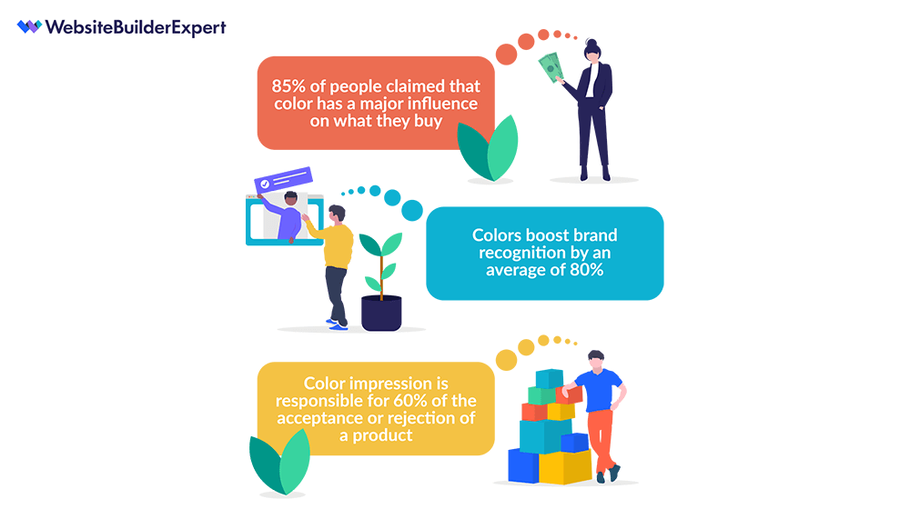
Colors have an immediate impact on people. The emotions and psychology of colors are very much real. And according to the report, 85% of them claim color has a major influence on what they buy. Not only that, but colors also boost brand recognition by an average of 80%. So, understanding the color that best represents your business and industry can go a long way in building and increasing that recognition factor.
With that in mind, the next step is to choose a color scheme that best suits your brand for your website. According to Duncan Lambden, who wrote the report, “You have to get a good understanding of what you are selling/providing.”
A quick example he gives is, choose purple if you trying to achieve a more premium, high-end image as people associate it with royalty, high quality, and intrigue. And if you want to reach a wider audience blue is the color because it is a reassuring, gentle color. Lambden says it fits well for more delicate subjects, like healthcare or financials.
Here are some examples of colors, brands, and what they covey:
- Red: Coca-Cola or Nintendo – Implies excitement or happiness
- Orange: Nickelodeon or Fanta – Implies a friendly, fun time is ahead
- Yellow: Nikon or McDonalds – Implies optimism and happiness
- Green: Whole Foods or Animal Planet – Implies freshness and nature
- Blue: Walmart or American Express – Implies dependability and reassurance
- Purple: Hallmark or Cadbury – Implies a distinguished brand that has a history of quality
- Brown: Nespresso or UPS – Implies a reliable product that can be used by anyone
- Black: Chanel or Adidas – Implies luxury or elegance
- White: Apple or Nike – Implies sleek, user-friendly products
The Colors for Your Website
The report suggests choosing a primary color and following it with additional colors that complement it. Follow this with a background color and typeface color.
For more on the importance of colors, not only for your website but your brand as a whole, take a look at the infographic below.

Image: websitebuilderexpert
This article, “How to Pick Colors for Your Business Website” was first published on Small Business Trends
